Screenshot

            page-template
              wrapper
                w1
                  header
                    container
                      header-container
                        a.logo
                  hero-section
                    container
                      span.sub-ttl -> animation
                      title-area
                        h1.title
                        p.description
                        a.button
                    img.background-image
                  history-section
                    text.area
                      span.title -> animation
                      h2.main-title
                      p.description
                    row#1
                      img.background-image
                      span.number -> animation
                      h3.subtitle
                    row#2
                      img.background-image
                      span.number -> animation
                      h3.subtitle
                    row#3
                      img.background-image
                      span.number -> animation
                      h3.subtitle
                  capabilities-section
                    container.left
                      h2.title
                      p.description
                      a.button
                    container.right
                      ul.capacities
                  testimonial-section
                    img.background-image
                    container
                      p.text
                      span.author
                      img.logo
                  contact-section
                    h2.title
                    text.area -> flex
                      img.person-headshot
                      contact-text-area
                        h3.let's-talk
                        p.text
                        a.phone-number
                    contact-form.section
              footer
                flex.container
                  work-with-us.section
                    h5.subtitle
                    employee.class -> flex
                      img.headshot
                      test-area
                        p-strong.name
                        p.description
                        a.email-address
                  connect-with-us.section
                    h5.subtitle
                    ul.socials
                  general-contacts.section
                    h5.subtitle
                    span.address
                    a.phone-number
                    a.email-address
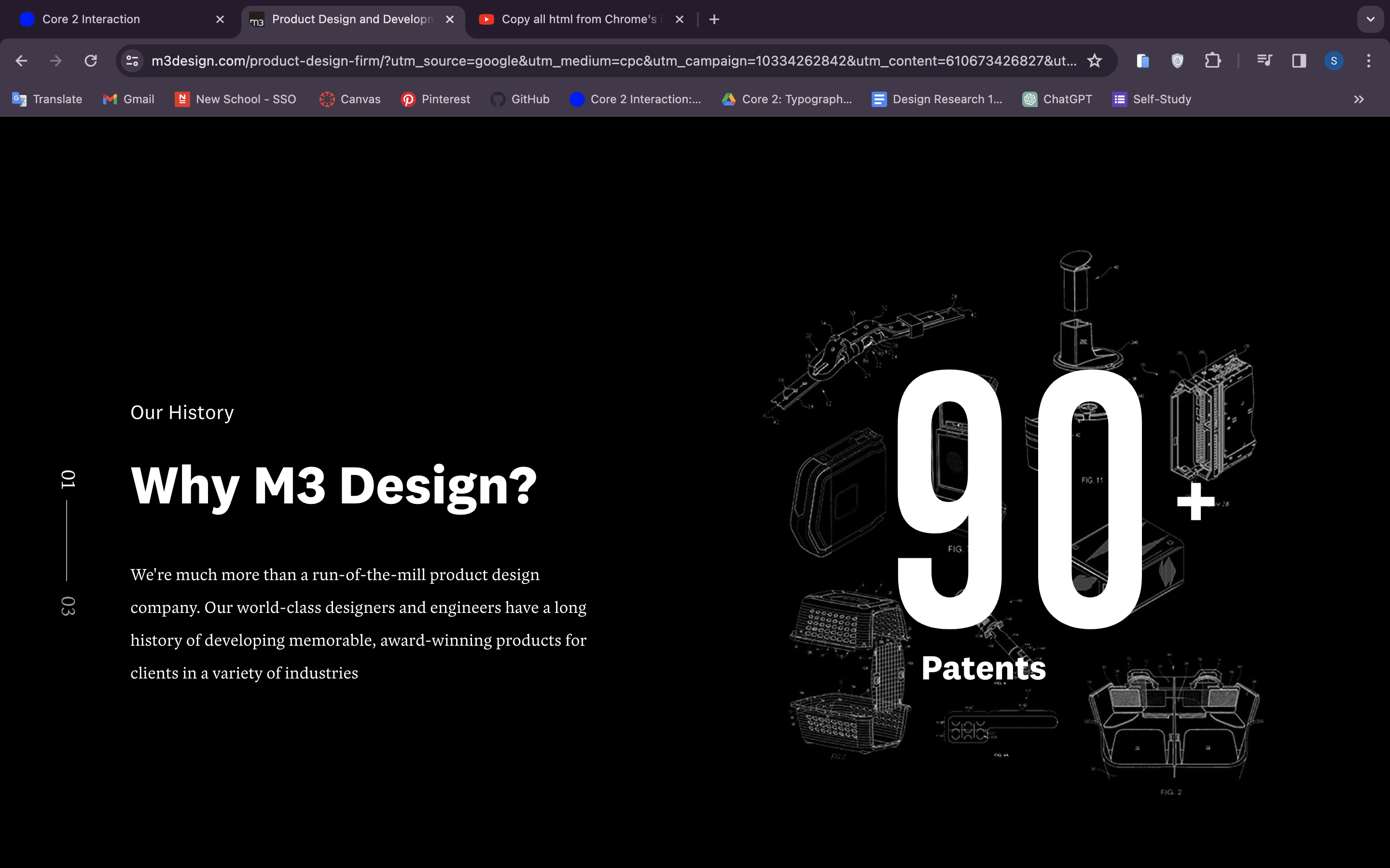
In general, this page is a series of thematic containers, such as hero-section, history, capacities, contact and footer. The middle sections has relatively similar structure of a background, title, description and an action call or button. The Hero section is a little bit modified by the addition of the logo animation and user interaction. The contact section is a unique one, including a form that the user can fill out, as well as the footer that containes all the credits and policies information.
What I liked particularly about the sintaxis of this website is that all the similar elements even across the sections belonged to the same class - eg. container class. This allowed a more cohiesive visual aesthetic and interaction logic for the user.
Maybe it is due to the lack of my experience, but I still found the code to be quite challenging to read. There was a number of alternative states and styles the order of which could have been ornganised a little bit more structured. Another thing that was unclear for me is the amount of additional span elements that the developer used for simple animations. Visually they looked like the ones you couls create using simple css key-frames or hovering states.
This website looks pretty easy visually, but the html includes a large amount of additional containers and divs for the aniamtions. I was wonderring if it was possible to make the code simplers keeping all the essentials animations and sunctions.
The contact us section with the form was particularly interesting for me. As far as I inderstood they created areas for user input using js. I didn't fully understand the code, so I would appreciate some little tutorial for the contanct forms during the classes.